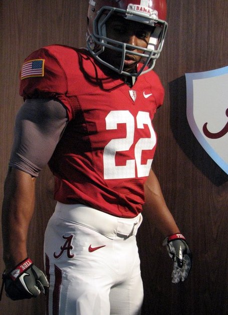
YUK !! Personally I think the houndstooth numerals is about 5 points below ghastly. It's criminal and this Nike interference in what our uniforms look like is asinine. Stupid! Stupid! Stupid!
Link: 2010 Nike Pro Combat System Bama Uniform Revealed
- Thread starter dewittfamily1
- Start date
I'd bet you a tidy sum, and give you good odds, that you won't even notice when we play the game.YUK !! Personally I think the houndstooth numerals is about 5 points below ghastly. It's criminal and this Nike interference in what our uniforms look like is asinine. Stupid! Stupid! Stupid!
The more I look at it the more I hate it. There is just way too much going on. There is no formal symmetry, no focal point. The eye just doesn't know where to look or what to do. The big American flags, with its red white and blue, the medieval shield with its silver and crimson background, the faded diagonal Houndstooth, which completely throws off the vertical/horizontal symmetry of the rest of the uniform, and gigantic script A on the pants all clash, they all clash horribly. Medieval armor and Bama football just don't go together, sorry, and the Houndstooth in the numbers is atrocious, I don't care if you can't see it in the sun. These jerseys are like a Southern Baptist going to a Buddhist temple in the heart of Las Vegas.
Interesting analogy..These jerseys are like a Southern Baptist going to a Buddhist temple in the heart of Las Vegas.
Yes, they sure as heck are trying in the name of selling more jerseys. The only way to keep selling more is to constantly change it up. I would think that every Alabama fan would realize that.Really? Somehow Nike can do anything to make us "lose our identity?"
Also, the Russell uniforms looked really cheap. I hope we don't go back there.
I don't think Russell's current unis look cheap (see Georgia Tech, although I am not crazy about their colors). At least when we wore Russell our unis were crimson...not red!
Y'all ever seen "Forgetting Sarah Marshall"? The quote this makes me think of:These jerseys are like a Southern Baptist going to a Buddhist temple in the heart of Las Vegas.
"And you know what? Let me tell you something about these tattoos, okay. That is Buddhist, that is Nordic, that is Hindu, that's just gibberish. They are completely conflicting ideologies, and that does not make you a citizen of the world, it makes you full of (s-word)!"
Translation: these jerseys are just too busy...
i realize that, but i'm ok with it.Yes, they sure as heck are trying in the name of selling more jerseys. The only way to keep selling more is to constantly change it up. I would think that every Alabama fan would realize that.
I don't think Russell's current unis look cheap (see Georgia Tech, although I am not crazy about their colors). At least when we wore Russell our unis were crimson...not red!
"You keep using that word. I do not think it means what you think it means."YUK !! Personally I think the houndstooth numerals is about 5 points below ghastly. It's criminal and this Nike interference in what our uniforms look like is asinine. Stupid! Stupid! Stupid!
Nooooooooo. I can't imagine a for-profit corporation doing such a thing like creating new products to sell in the marketplace. Why that's just crazy.Yes, they sure as heck are trying in the name of selling more jerseys. The only way to keep selling more is to constantly change it up. I would think that every Alabama fan would realize that.
I don't think Russell's current unis look cheap (see Georgia Tech, although I am not crazy about their colors). At least when we wore Russell our unis were crimson...not red!
THIS.Some of you guys are true drama queens.
Finally...
Could be worse. The jerseys could be black.
Part of the problem with the way our jersey's looked at the unveiling was that goofball wearing it. He didn't look like a football player. He looked short and stocky and the jersey and helmet looked almost too big for him.
Put that jersey on Hightower and I guarantee you're opinion would change.
Put that jersey on Hightower and I guarantee you're opinion would change.
Thats what I'm hoping for.Part of the problem with the way our jersey's looked at the unveiling was that goofball wearing it. He didn't look like a football player. He looked short and stocky and the jersey and helmet looked almost too big for him.
Put that jersey on Hightower and I guarantee you're opinion would change.
I will hate Nike more for making Dont'a look silly.Part of the problem with the way our jersey's looked at the unveiling was that goofball wearing it. He didn't look like a football player. He looked short and stocky and the jersey and helmet looked almost too big for him.
Put that jersey on Hightower and I guarantee you're opinion would change.
When did I ever use the word "criminal" in any other post beside this one?YUK !! Personally I think the houndstooth numerals is about 5 points below ghastly. It's criminal and this Nike interference in what our uniforms look like is asinine. Stupid! Stupid! Stupid!
"You keep using that word. I do not think it means what you think it means."
And as for "drama queens", only "drama queens" ever have a tendency to use that phrase. So, let's cut out the name calling and allow people to have their own opinions without adding your own "drama" to the situation.
These unis suck. End of story.
Last edited:
It's ONE freakin game people. Deal with it, the way people are posting you'd think we're wearing these uniforms every game.
I like these as alternate uniforms. They aren't that big of a change and they embrace our tradition. Our uniforms have changed a lot through the years. We act like they have been the same for 100 years but that's not the case. Look back at the 60s, they were quite different. Everything changes. I like to mix it up a bit.
I totally agree. I wouldn't mind if they wore them every game. In times past, nobody was happy if we didn't get a "Bama Guy" to be the coach, but look at us now. Sometimes change is good.I like these as alternate uniforms. They aren't that big of a change and they embrace our tradition. Our uniforms have changed a lot through the years. We act like they have been the same for 100 years but that's not the case. Look back at the 60s, they were quite different. Everything changes. I like to mix it up a bit.
Besides, the changes are so mild, I really don't see what all the crying is about.
Oh yeah, RTR! They are my team even no matter what the unis look like!
Or look like the Oregon State ones with the GIANT numbers or the Ohio State ones....bleh! I thought they were Georgia.Finally...
Could be worse. The jerseys could be black.
These changes are so slight that I bet that if there had been no announcement and hoopla and the team just ran out in these the vast majority of folks wouldn't even notice differences. A few folks mights say, "Hmm something looks a little bit different."Take a snapshot of our uniforms in 1970, 1980, 1990, 2000, and now this one as 2010 and I bet the subtle differences between each would be comparable.
TideFans.shop - Get your Gear HERE!
Alabama Crimson Tide Car Door Light
Get this and many more items at our TideFans.shop!
Purchases may result in a commission being paid to TideFans.